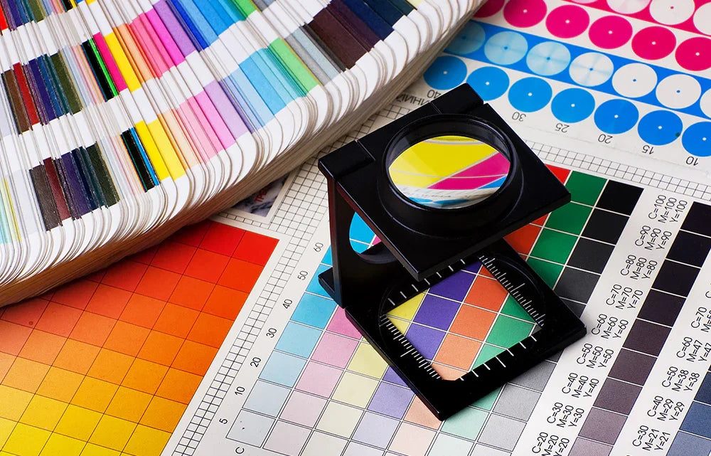
Navigating color can be challenging—you hear terms thrown around all the time, full color, CMYK, RGB, Pantone®—but what does it all really mean? Is one better than the other? What happens when you choose one over the other?

What is a Pantone® Color?
A Pantone® color is a specific shade chosen from the Pantone Matching System (PMS), a standardized color reproduction system used across various industries, including printing, fashion, and manufacturing. Each Pantone® color is assigned a unique code, ensuring that the color remains consistent no matter where or how it’s produced. This eliminates discrepancies that can occur when printing from different locations or on different materials.
Pantone® colors are typically used in spot color printing, where a pre-mixed ink is applied in a single run for each specific color, offering high precision and vibrancy. Pantone® spot colors are exact, making them perfect for brand logos or designs where color consistency is crucial.

Full color printing - What is it and what does it mean?
Full-color printing, also known as 4-color process printing or CMYK printing, is a printing technique that uses four primary colors—Cyan (C), Magenta (M), Yellow (Y), and Key (Black, K)—to create a wide spectrum of colors. By combining varying amounts of these four inks, printers can reproduce almost any color in an image or design. This method is ideal for producing detailed, vibrant images like photographs, gradients, and complex graphics.
In the promotional products industry, full-color printing is used to create high-quality, customizable designs, such as logos, patterns, or images, on items like bottle openers, lanyards, or keychains. This technique is popular because it allows for detailed and colorful decorations on various products.
But isn't everything technically printed in full-color?
Most printed products are produced using equipment that relies on the CMYK process. At first glance, this might suggest that choosing PMS colors wouldn't make much of a difference. However, that's not always the case. Why? Because each piece of printing equipment is unique, manufacturers use different consumables (like ink and toner), and even the material you print on can affect the final color.
These factors can lead to subtle (and sometimes dramatic) variations in color each time a product is printed. By using PMS colors, however, digital printing equipment is specifically calibrated to match those precise shades, ensuring consistent, accurate results every time.
A Pantone color is a Pantone color is a Pantone color ... Right?!
Pantone® colors are organized into a series of guides, which are physical or digital tools used to select, identify, and communicate precise colors. These guides, produced by Pantone®, Inc., are part of the Pantone® Matching System (PMS) and help designers, printers, and manufacturers ensure consistent color matching across various mediums and materials.
There are several types of Pantone® guides, each serving a different purpose. These include guides for coated and uncoated colors, fashion colors, metallics, neons, process guides, and more.
You might assume that any PMS color can be matched exactly. While that’s technically true, not all print providers offer PMS matching for every Pantone® system. It is also important to know that additives are needed to accurately create the metallic and neon Pantone® colors and these additives are not available with digital printing and that coated colors and uncoated colors are not the same color.
THERE CAN BE A BIG DIFFERENCE BETWEEN COLOR SYSTEMS EVEN IF THE NAME IS THE SAME

It’s important to confirm which Pantone® systems your print provider uses before creating or submitting artwork. This will help avoid any surprises when it comes time to print.
Summing It All Up
Navigating color printing can be challenging. Each system serves different purposes and offers unique benefits. Pantone® colors provide a standardized way to ensure color consistency, making them ideal for projects where exact color matching is crucial, while full-color printing, uses a mix of primary colors to create a broad range of shades, perfect for detailed and colorful designs. What's important is choosing the right method for your artwork, and the print professional, in order to get the best results.

