 In General
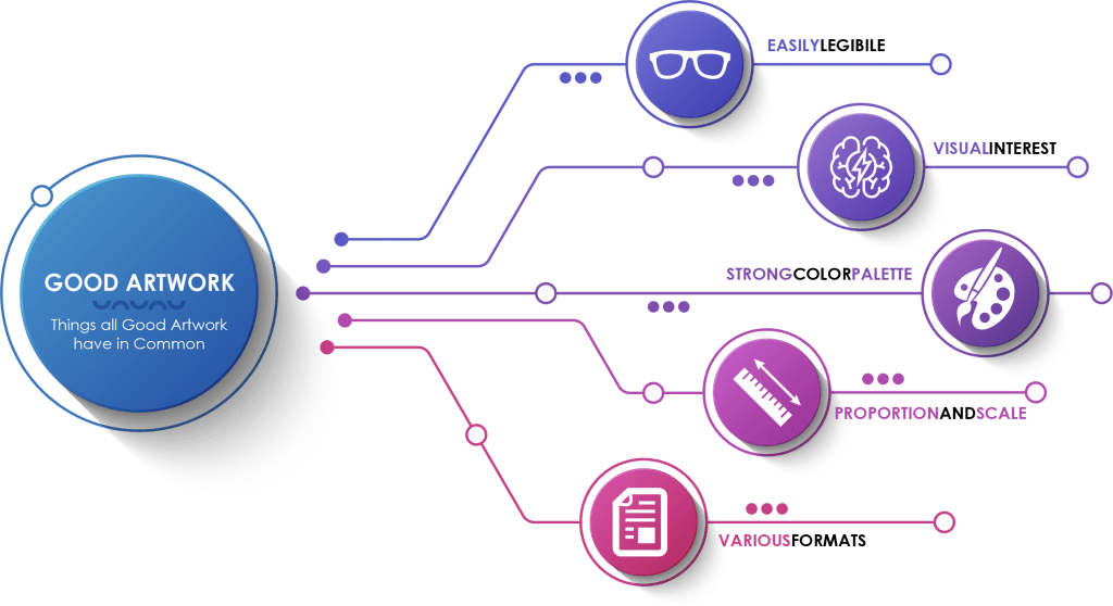
I’ve been a graphic designer for over 20 years, and in those decades I’ve seen many, many logos and tons of layouts. Some are fantastic, some are good, and some leave a lot to be desired. So what is the difference between them and what makes some better than others? Five basic things…
- Legibility
- Visually Interesting
- Strong Color Palette
- Sizing/Scaling/White Space
- Format
What All Good Artwork Has In Common
Legibility: A good layout should be legible at all sizes. Someone who is looking at your layout shouldn’t have to struggle to read it whether it is the size of a billboard or a business card. It stays away from overly complicated designs, small text, and colors that don’t have enough contrast.
Communication: Well designed artwork always communicates an idea and is interesting whether it is because of the content, the colors, or what it conveys. What the artwork communicates may not be pleasant, but it should be interesting to look at and its intent should be clear.
Flexibility and Format: Good logos work in vertical as well as horizontal spaces without looking crowded, off balance or crushed. Branding standards and guidelines are sometimes rigid and make using a logo difficult in some cases, but most allow for vertical and horizontal formats, and also often offer a simplified version for black and white printing as well as small areas. Logos should always be designed as vector art which will allow them to scale to almost any size.
Longevity: Artwork that is well designed also takes into account how it will be used both now, and in the future, and is saved with a variety of available sizes and formats. Is it really going to be used only for the web? It’s being used for print right now but what about in 6 months or a year? Will it ever be printed really big? Is it ever going to be used on something small? Thinking ahead makes utilization easier when the time comes.
All of these things together add up to a recipe for success.
So How Does This Affect My Badge Reel?
Artwork for badge reels present unique challenges; the main obstacle being their size. While Devara offers a wide selection of shapes and sizes of badge reels, the imprint area is much smaller than most areas artwork is traditionally printed. What looks great on a 24” x 36” poster is not going to be very legible on a badge reel that has an imprint area that is less than 2-inches across.
That means when selecting artwork for badge reels, the simpler the art, the better.
Where People Go Wrong…
Many customers concentrate on price or fall in love with a specific reel shape instead of focusing on how their art will look on a given reel. Not all art is meant to be printed on all shapes and sizes and that should be considered when selecting your product.
Not sure if you are making the right choice? Ask us! We are here to help and nothing makes us happier than knowing we have given a customer all the information they need so that they can have a really good end product.
General Guidelines
- Use vector art whenever possible. It allows the imprint to be scaled and sized as needed and we can revise colors if needed.
- Raster art needs to be at least 300 dpi when placed inside the imprint area but it cannot be modified in any way.
- Avoid large amounts of text, very fine text and text that is small. Remember badge reels are small and often work at waist level.
- Make sure there is some margin around the inside of the imprint area. Positioning your logo right up against the edge not only doesn’t look good, but it could also get trimmed off.
- Be careful using gradations in small areas.
- If a color is important, be sure to select and use PMS colors.
- Design your layout for the reel you are using or select a reel that fits your layout.
- Have fun with it. Devara has so many variations that we really do have a reel for everyone. Don’t be afraid to have fun and be creative!